Between the years of 1972 and 2010, Crown Point Press in San Francisco was one of the finest printmaking studios in the country, turning out stunning works by many leading artists. The perfect finished print, though, rarely gives us a glimpse into the tortured process that may have led to the final proof. “Yes, No, Maybe,” on view at the National Gallery of Art in Washington, D.C, explores this iterative process by juxtaposing rarely seen preliminary test prints, working proofs, and final prints, many of them owned by the gallery.

Photo maquette, "Keith," 1972, Chuck Close

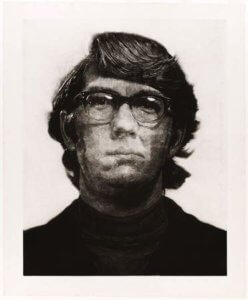
Photo maquette, “Keith,” 1972, Chuck Close

Although the show features some twenty-five artists, I’ll dwell here with my favorites: Richard Diebenkorn, Chuck Close, and John Cage. Quotes from each artist illuminate the work: Diebenkorn boiled down all artistic endeavor to being “…in the nature of problem solving,” while Cluck Close said, “The far more important thing is problem creation (italics mine),”and for John Cage, it’s all about “…asking questions instead of making choices.”

"Keith," 1972, by Chuck Close

“Keith,” 1972, by Chuck Close

The show opens with the evolution of Chuck Close’s “Keith,” 1972. In this work, Close—drawn by the velvety blacks and pearly whites the process produces—challenged himself to produce the largest mezzotint possible. Could the process work at great size on one of his “mug shot” portraits? He joined Crown Point’s founder Kathan Brown and the Fine Arts Museum of San Francisco’s works on paper group to find out. The mezzotint process involves scraping and pitting the plate to give a highly textured ground. Close learned as he went, while Brown and the printmaking team experimented with photo etching. The sheer size of the finished product caused the work to take months, rather than the usual weeks. Somewhere in the process, Close decided to leave in the faint background grid lines in the final print, a trademark of his later work. In the final result, Keith’s asymmetrical face appears to be viewed from under water, the expression constantly changing to reveal interior psychological depths.

"Touched Red," 1991, by Richard Diebenkorn

“Touched Red,” 1991, by Richard Diebenkorn

Revision was also essential to Richard Diebenkorn’s work. “I seem to have to do it elaborately wrong and with many conceits first, then maybe I can attack and deflate my pomposity and arrive at something straight and simple.” Repetitions and comparisons between the lines, shapes, and colors finally coalesce in a state of “rightness,” but at the same time allow for “a sudden surprising contradiction.” “Touched Red,”1991, was the result of pasting shapes over and over in 40 working proofs, all of which belong to the NGA, a gift from Crown Point Press. In the final result the work’s patinated surface appears to have accumulated over time, like the paint layers on an old screen door.

"Green," 1986, by Richard Diebenkorn

“Green,” 1986, by Richard Diebenkorn

The evolution of “Green,” 1986, shows Diebenkorn’s attempts to “steal a second chance.” Earlier images seen in the working proofs (an infinity symbol, the upturned tail of a cat) are gone in the final, subsumed by the luminous ground of green and vivid cobalt reminiscent of the oil paintings of Diebenkorn’s Ocean Park and Berkeley series. The tranquil aerial views of those paintings also come to mind in “High Green Version,” 1992.

Trust John Cage, who didn’t think of himself as an artist at all, to produce some of the most fascinating work in this show. Cage’s interests in Zen, natural history, and numeric theory shape the works he produced while at Crown Point Press.

"Eninka 29," 1986by John Cage

“Eninka 29,” 1986by John Cage

In a video we see Kathan Brown and Cage, collaborating on Cage’s “Eninka 29,” running burning newspaper and damp sheets of paper through the press to create ethereal, subtle, shifting images. Also visible are brandings with a hot coil. At the first successful print, Cage exclaimed, “Oh, it’s beautiful! I can’t believe it! I couldn’t sleep all night. I thought my whole life had been a waste!”

"75 Stones," 1989, by John Cage

“75 Stones,” 1989, by John Cage

In “75 Stones,” 1989, Cage selected a palette based on the color of the stones and then positioned the rocks by chance calculation. The project began as an homage to the 15 stones in the Zen rock garden at Roanji, Japan. Cage started with 15, but wound up with 75, which seemed the right number. Don’t the images have a calligraphic, Japanese feel?

“17 Drawings by Thoreau,” 1978 is a fetching tribute, using images of a hawk feather, hazel nut, and rabbit tracks. The position, orientation, scale, and color of the images were also calculated by computer “chance operations.” In Cage’s mind, even though he couldn’t draw (or thought he couldn’t), the process rendered the images “beautiful.” I agree.

"17 Drawings by Thoreau," 1978, by John Cage

“17 Drawings by Thoreau,” 1978, by John Cage

If you love works on paper, and crave being a voyeur in the print shop, the show will be up until January 5, 2014. There’s still time!

http://www.nga.gov/exhibitions/crownpoint.shtm

"Smoke Over Rooftops," Fernand Leger, 1911

“Smoke Over Rooftops,” Fernand Leger, 1911

Philadelphia’s Museum of Art’s massive show, “Leger: Modern Art and the Metropolis,” brings to mind Banksy, the poltergeist graffiti artist who bombed New York City recently with what has been described as a brilliant self-promoting PR campaign by some and a cleverly creative outburst of ephemeral art by others. Either way, the art (or vandalism, if you prefer) could not exist without the city as canvas.

And so it is with Fernand Leger (1881 – 1955) and his 1920s Paris circle. The metropolis—its movement, mechanization, hustle, clamoring billboards, buildings reaching skyward—shaped their ideas about art, artists, and modern life. The show opens with film footage of the Eiffel Tower made in 1900 by Thomas Edison. As the viewer rises with the camera, the city’s streets, buildings and parks flicker behind the geometric girders in a surreal montage—a fitting introduction.

"The City," Fernand Leger, 1919

“The City,” Fernand Leger, 1919

Nearby hangs “Smoke over Rooftops,” 1911, Leger’s first Paris cityscape—the view from his studio. Billowing smoke rises over the hard edges of the rooftops. Only nineteen when he first came to Paris, Leger encountered there an upheaval of technology: telephones, radios, the press, electric lights, and more.

After recovering from being gassed in the Great War (Leger went to the front for four years), he returned to “gobble up Paris” and “stuff it in my pockets.” Declaring that he “got myself out of the grays as quickly as possible,” he created “The City” in 1919. Owned by the Philadelphia Museum of Art, “The City” is the centerpiece of the show. This large piece (about the size of a cinema screen of the day) reveals none of the moody atmosphere of the earlier work. Instead, the intentionally horizontal composition hustles us along, as if down the street. Meant to be viewed like a billboard, each element appears to be equal in importance: the scaffolding, the pole, the signs’ punchy colors.

"Razor," Gerald Murphy, 1924

“Razor,” Gerald Murphy, 1924

By drawing on contemporary advertising images—here the recently invented safety razor—Gerald Murphy’s “Razor,” 1924, had enormous influence on later painters, especially pop artists in the 1960s. Murphy, a “Lost Generation” compatriot with F.Scott Fitzgerald, Ernest Hemingway, et al, hosted Leger on his first trip to the United States in 1931. The accompanying notes tell us that in this image Murphy intentionally exploited the French view of America as being “hyper-modern and mechanized.”

"Ballet Mecanique," Fernand Leger, Dudley Murphy, Man Ray, 1924

“Ballet Mecanique,” Fernand Leger, Dudley Murphy, Man Ray, 1924

For this viewer, the 1924 experimental film produced by Leger and film maker Dudley Murphy, with help from Man Ray, was a surprise that was worth the price of admission. A Dada tour de force, its riot of images is enlivened by the accompanying music, which used mechanized player pianos, airplane propellers, electric bells and sirens. While many of Leger’s paintings appear to this eye as flat, orderly, and a tad sterile, this film succeeds in bringing the spirit of mechanization and modern life together in a radical-for-the time work of art. Take a look: http://www.youtube.com/watch?v=Ez0LuU-Mg34

Curtain from "Skating Rink" ballet, Fernand Leger, 1922

Curtain from “Skating Rink” ballet, Fernand Leger, 1922

Leger, a lover of all mass entertainments—the circus, skating rinks, theater—collaborated with the Ballets Suedois on “The Skating Rink,” 1922. Watercolor designs for the ballet’s costumes hang before a curtain which was recreated from the original 1921-22 design by Leger. In choreography also inspired by Leger, the dancers move in stilted, jerky ways that would seem at odds with the gliding, elongated movement of ice skaters.

"Model for Private House," van Doesburg and van Eesteren, designed 1923, built 1982

“Model for Private House,” van Doesburg and van Eesteren, designed 1923, built 1982

The final room—devoted to “space”—gives us the utopian vision of Leger and his followers, as embodied in De Stijl architects Theo van Doesburg and Cornelis van Eesteren’s “Model for a Private House,” 1923, reconstructed, 1982 by Tjarda Mees. The architects thought of a house not as an enclosed cube, but as a series of intersecting planes painted in bright Mondrian colors which would create spaces that opened up to the environment as well as sheltered its inhabitants.

"Composition for Hand and Hats," Fernand Leger,  1927

“Composition for Hand and Hats,” Fernand Leger, 1927

“Composition for Hand and Hats,” 1927, shows us how far Leger has come from the earlier smoke and rooftop composition. This cerebral composition carries, at least for this viewer, none of the emotional wallop found in some of Leger’s contemporaries, among them (and also on view here): Piet Mondrian, El Lissitzky, Robert Delaunay, Sonia Delaunay-Terk, Pablo Picasso, Le Corbusier, Francis Picabia, and Marcel Duchamp. The gathering of so many important artists is impressive and gives the viewer a heady dose of the ideas and influences at work of the time. Whether the curators’ intention of revealing Leger’s painting, “The City,” as the impetus for this outpouring is still, in my view, an open question.

Go see for yourself! The show will be on view until January 5, 2014.

Learn more here:

http://www.philamuseum.org/exhibitions/766.html