Between the years of 1972 and 2010, Crown Point Press in San Francisco was one of the finest printmaking studios in the country, turning out stunning works by many leading artists. The perfect finished print, though, rarely gives us a glimpse into the tortured process that may have led to the final proof. “Yes, No, Maybe,” on view at the National Gallery of Art in Washington, D.C, explores this iterative process by juxtaposing rarely seen preliminary test prints, working proofs, and final prints, many of them owned by the gallery.

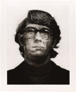
Photo maquette, “Keith,” 1972, Chuck Close
Although the show features some twenty-five artists, I’ll dwell here with my favorites: Richard Diebenkorn, Chuck Close, and John Cage. Quotes from each artist illuminate the work: Diebenkorn boiled down all artistic endeavor to being “…in the nature of problem solving,” while Cluck Close said, “The far more important thing is problem creation (italics mine),”and for John Cage, it’s all about “…asking questions instead of making choices.”

“Keith,” 1972, by Chuck Close
The show opens with the evolution of Chuck Close’s “Keith,” 1972. In this work, Close—drawn by the velvety blacks and pearly whites the process produces—challenged himself to produce the largest mezzotint possible. Could the process work at great size on one of his “mug shot” portraits? He joined Crown Point’s founder Kathan Brown and the Fine Arts Museum of San Francisco’s works on paper group to find out. The mezzotint process involves scraping and pitting the plate to give a highly textured ground. Close learned as he went, while Brown and the printmaking team experimented with photo etching. The sheer size of the finished product caused the work to take months, rather than the usual weeks. Somewhere in the process, Close decided to leave in the faint background grid lines in the final print, a trademark of his later work. In the final result, Keith’s asymmetrical face appears to be viewed from under water, the expression constantly changing to reveal interior psychological depths.

“Touched Red,” 1991, by Richard Diebenkorn
Revision was also essential to Richard Diebenkorn’s work. “I seem to have to do it elaborately wrong and with many conceits first, then maybe I can attack and deflate my pomposity and arrive at something straight and simple.” Repetitions and comparisons between the lines, shapes, and colors finally coalesce in a state of “rightness,” but at the same time allow for “a sudden surprising contradiction.” “Touched Red,”1991, was the result of pasting shapes over and over in 40 working proofs, all of which belong to the NGA, a gift from Crown Point Press. In the final result the work’s patinated surface appears to have accumulated over time, like the paint layers on an old screen door.

“Green,” 1986, by Richard Diebenkorn
The evolution of “Green,” 1986, shows Diebenkorn’s attempts to “steal a second chance.” Earlier images seen in the working proofs (an infinity symbol, the upturned tail of a cat) are gone in the final, subsumed by the luminous ground of green and vivid cobalt reminiscent of the oil paintings of Diebenkorn’s Ocean Park and Berkeley series. The tranquil aerial views of those paintings also come to mind in “High Green Version,” 1992.
Trust John Cage, who didn’t think of himself as an artist at all, to produce some of the most fascinating work in this show. Cage’s interests in Zen, natural history, and numeric theory shape the works he produced while at Crown Point Press.

“Eninka 29,” 1986by John Cage
In a video we see Kathan Brown and Cage, collaborating on Cage’s “Eninka 29,” running burning newspaper and damp sheets of paper through the press to create ethereal, subtle, shifting images. Also visible are brandings with a hot coil. At the first successful print, Cage exclaimed, “Oh, it’s beautiful! I can’t believe it! I couldn’t sleep all night. I thought my whole life had been a waste!”

“75 Stones,” 1989, by John Cage
In “75 Stones,” 1989, Cage selected a palette based on the color of the stones and then positioned the rocks by chance calculation. The project began as an homage to the 15 stones in the Zen rock garden at Roanji, Japan. Cage started with 15, but wound up with 75, which seemed the right number. Don’t the images have a calligraphic, Japanese feel?
“17 Drawings by Thoreau,” 1978 is a fetching tribute, using images of a hawk feather, hazel nut, and rabbit tracks. The position, orientation, scale, and color of the images were also calculated by computer “chance operations.” In Cage’s mind, even though he couldn’t draw (or thought he couldn’t), the process rendered the images “beautiful.” I agree.

“17 Drawings by Thoreau,” 1978, by John Cage
If you love works on paper, and crave being a voyeur in the print shop, the show will be up until January 5, 2014. There’s still time!