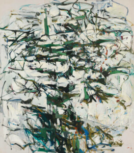
“Hemlock,” 1956

Up until this summer, I’d seen only one or two of Joan Mitchell’s paintings and they were always hung with other painters’ work. Thanks to my friend, Bonnie, who invited me to join her at the Mitchell retrospective at the Baltimore Museum of Art, I might not have found an artist who has become an inspiration in my life – not that I’m flinging paint at canvas, although it’s tempting. I’m trying, in a quieter, smaller way, to find my own version of her path, which combined a deep immersion in nature, music, and poetry, and resulted in some of the most exuberant, courageous, and original art I’ve ever experienced.

Digital versions of Mitchell’s monumental paintings will only give you a suggestion of the real thing, like a baseball card compared to a living, breathing athlete in action. But it’s what we have, so here goes.

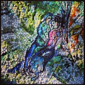
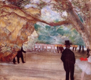
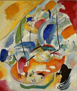
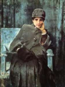
This stunning retrospective (co-curated by the San Francisco Museum of Modern Art and the BMA) is organized chronologically, so we see Mitchell’s early art in the first room. Born in 1925 to a wealthy and cultured Chicago family, young Joan studied (as my father did a decade or so before her) at the Art Institute. Several of these early works are breathtaking: “To the Harbor Master” (1957) and “The Bridge” (1956; the first of her many diptychs) among them, but the one that stopped me in my tracks was “Hemlock,” (1956). I hadn’t looked at the wall plaque, so didn’t know the title immediately, but instantly felt its stately tree-essence. The crisp, fragrant boughs (somehow the painting seemed to give off a wintry, evergreen scent) are set off by a snowy white field, the sweeping branches speckled with blue, orange, and crimson, like flashes of birds pecking at the tree’s base.

The title comes from a Wallace Stevens poem, “Domination of Black.”

“Out of the window, / I saw how the planets gathered / Like the leaves themselves / Turning in the wind. / I saw how the night came, / Came striding like the color of the / heavy hemlocks. . .”

At that point, I was hooked.
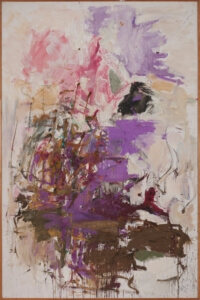
“Untitled,” 1961

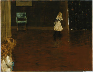
In the second room, I was equally floored by “Untitled,” (c. 1961). Nearby hangs a photo of Mitchell in her Paris loft—by now, she was splitting her time between New York and Paris. In New York she’d become a known artist in the emerging abstract expressionist vein, including Elaine de Kooning, Helen Frankenthaler, and Lee Krasner, among others. The scene in New York was intense, and increasingly, Mitchell sought the relative obscurity of Paris where she felt comfortable following her own muses. “Untitled” is like the flip side of “Hemlock.” The brooding green/black is gone, exploding in Easter egg color, as if the artist said, “Oh, what the hell,” as she squirted magenta directly from the tube onto the canvas. This bloom of color seems to emerge from a muddy ground of splotches, drips and fishtails of paint. Mitchell appears to revel in improvising with the paint: making flicks, swirls, dabs. The black blob rescues the lilac from a too-pretty realm, giving it heft and balance. I was soon lost in the ravishing tangle at the left, marveling at the artist’s freedom with the splotchy slaps of turquoise, crimson, ochre, white, plum, and jade. Experiencing this painting results in an upwelling of feeling as one’s sightline is drawn up to a pale sky.
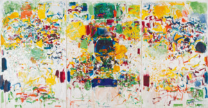
“Sans Neige,” 1969

As you enter the next room, you’re greeted by an enormous triptych, “Sans Neige,” 1969, painted after Mitchell had moved from Paris to La Tour, her estate along the Seine in Vétheuil, France. Coincidentally, or perhaps by design, Monet, one of the painters she most admired, lived and painted in a cottage on the very same estate. The curators at the San Francisco Museum of Art speculate that the title, “Without Snow” in English, could be a “sly reference to Monet’s well-known paintings of Vétheuil in winter…” Unlike “Hemlock” and “Untitled” which evoke the majesty and exuberance of nature, this work plunges the viewer into a bustle of human life. It’s a show-stopper, a brilliant carnival whirl of crowds, activity, the swirling life of cafes, whipping flags, even animal tracks, weaving among the grounding rectangles of crimson and blue. It’s irresistible, joyous, and celebratory of human life.

In the next gallery, a video shows Mitchell welcoming an interviewer into her La Tour studio. The two women sit on a bench by the window and gaze out at the magnificent view of fields, the town, and the river. The interviewer says something like, “How wonderful it must be to look out this window and paint.” Michell replies, gesturing at the view, “Oh, I could never even try to paint that…” Rather, she says, she closes the shutters to paint, preferring to conjure memories of times, places, people, and nature, carrying her landscapes with her.
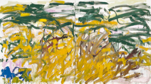
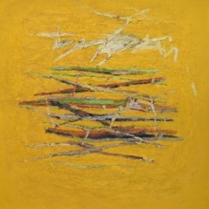
“No Birds,” 1987

We can’t know why there are no birds in “No Birds” (1987-88), even if we can guess why there’s no snow in “Sans Neige,” but Mitchell’s intent to pay homage to Van Gogh’s “Wheatfield with Crows” (1890), is clear. Made late in Mitchell’s life when, diagnosed with cancer, she was often in pain, this startling work seems to reveal that she, with her typical courage and honesty, is facing her mortality. It’s as if the absent crows have left black contrails in Mitchell’s painting, and Van Gogh’s vivid blue sky is now a crouching pool at the far left. But the bright yellow field is vibrant, the wheat stalks burst forth from the horizontal ground, and the turbulent movement speaks to me more of life than death.

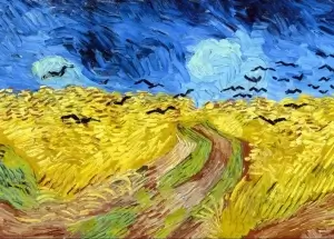
“Wheatfield with Crows,” by Vincent Van Gogh, 1890

At La Tour, Mitchell spent many hours with her artist friends, among them composer Gisèle Barreau. The two spent countless hours listening to music and playing it together. “Two Pianos,” 1980, is named for a Barreau composition, also 1980. I looked it up on YouTube, but found only this video of a performance of “Blue Rain,” 1998, for two pianos and percussion. You can listen here: https://www.youtube.com/watch?v=DrrXz6ZOWLE.

“Blue Rain” was composed six years after Mitchell’s way-too-early-death at 67. Listening to Barreau’s music, though, I can picture the two women playing together, perhaps with Mitchell’s beloved dogs at their feet. It’s tempting to see two different personalities in the two sides of the diptych, one spare, pale, and diffident, the other dense, rich, passionate, and persistent. Of course, one can also “see” the music dancing before your eyes and revel in the back and forth between the “two pianos.”

“Two Pianos,” 1980

In addition to these and many more wonderful paintings, the show offers a trove of ephemera: sketch books, correspondence, photographs, the video shot at Vétheuil, and one of Mitchell and friends sailing in the Mediterranean. Some small works balance the monumental ones, too, especially a wall of ravishing pastels made directly on paper with typewritten poetry by friends.

What a rich and impressive life, and what a rich and moving show.

The Joan Mitchell retrospective at BMA is up until August 14, 2022. If you possibly can, do try to see it.

https://artbma.org/exhibition/joan-mitchell


Bouquet of Concaves, by David Smith

All my life, art museums have been refuges, places to peer into the faces of long dead men, women, and children, to inspect the clothing worn in the 16th century, to be pulled into the vortex of a Pollack paint storm, to feel the power of ancient African sculpture, so fresh and modern in its lines. And when I come away from a particularly inspiring show, blinking into the sunlight, the whole world looks different.

Fittingly, the Phillips Collection’s centennial show is titled “Seeing Differently: the Phillips Collects for a New Century.” In 1921, Duncan and Marjorie Phillips opened their Washington, DC home and their art collection to the public, thus establishing America’s first museum devoted to modern art. The gallery was to serve as a memorial to his father and, poignantly, to his brother, James, who died in the 1918 influenza epidemic.

No 9, by Bradley Walker Tomlin

I’ve been to the show twice (it’s up through September 12, so you still have time to go). What struck me most each time were the vibrant new acquisitions by artists I knew little about. But as I started out in the  addition to the gracious old brownstone house, a couple of old favorites snagged me anew.

Perched in an alcove as you walk down the steps into the main first floor gallery is David Smith’s painted steel sculpture, “Bouquet of Concaves,” 1959. This small sculpture has always appealed to me, with its hieroglyphic-like shapes which can be read either right to left or left to right. Somehow all the shapes are perfectly aligned, as if they organized themselves in such a way as to find utmost comfort. So, it was no surprise to learn that this piece was the first Smith made without preliminary drawings, simply laying the pieces out on a sheet of white paper on the floor and coming back to them day after day, moving one here, one there, until the pieces “found the arrangement.” During his collecting lifetime, Duncan Phillips very much wanted to acquire a Smith sculpture, but never bought one due to the high prices they commanded in the ’sixties. In 2008, forty-two years after his uncle’s death, Phillips’ nephew, Gifford, and his wife Joann Phillips, gave this sculpture to the collection.

Kin XXXV (Glory in the Flower), by Whitfield Lovell

Another long-time favorite is Bradley Walker Tomlin’s 1952 painting, “No. 9,” also in the first-floor gallery. I love the pairing of the Smith sculpture and this painting. Both are so graphic and each has an Asian quality, speaking of balance and order, possibly achieved, in the Tomlin work, by a linear grid in which the pale brush strokes float to the foreground. So full of life and dancing spontaneity, this piece was painted only a year before Tomlin’s death. The work also hearkens back to his long friendship with Adolph Gottlieb who, thankfully, encouraged him to move away from Cubism to a looser, more gestural abstraction, perhaps allowing the shapes to find their perfect arrangement in much the way Smith did.

Entering the second-floor gallery, one of the newer acquisitions (2016) drew me in immediately: a striking conte crayon drawing, “Kin XXXV (Glory in the Flower),” by Whitfield Lovell, 2011. Every pore is visible in this skillfully rendered portrait, while the pairing of the man’s face and the clock radio causes a conversation to take place between them. The man’s hat appears to be from a bygone era, the radio certainly is. The passage of time is evident in the two faces: the man’s is black, with a sheen that seems to come from within. The clock’s face is white, featureless, blank, save for the stark black numbers. Time has taken its toll on the man – what he’s seen, what’s happened to him, the joys and the sorrows seem to have left him hollowed out. The radio, on the other hand, is plastic, pristine. We hear stories and music on the radio, canned, packaged and transmitted to us over the airwaves, but now, the radio is mounted with the man, and both are forever silent.

Maman Calcule, by Aime Mpane

What is Lovell saying about the communion between the man and the object? In search of answers, I found a Washington Post review of an earlier Phillips Collection show of Lovell’s “Kin” series. Over the years, this MacArthur grant winner accumulated a trove of old daguerreotypes, photos, and postcards from the early 1900s to the 1960s. From these long-gone faces he draws inspiration for his hyper-realistic, deeply sensitive portraits. One day, he says, he picked up an object, a “bust,” and held it next to one of his drawings. The object seemed to bring the drawing to life. Since then, he’s paired drawings with inanimate objects to create a back-and-forth dimension, all paying tribute to people who have never before been memorialized. Click her for the full review: https://www.washingtonpost.com/entertainment/museums/an-artist-refashions-the-past-whitfield-lovells-kin

A final question: what about the title, “Glory in the Flower”? The line comes from the Wordsworth poem Ode: Intimations of Immortality from Recollections of Early Childhood:

“Though nothing can bring back the hour

Of splendor in the grass, of glory in the flower;

We will grieve not, rather find

Strength in what remains behind…”

On the Way to the Cemetery (Tixan), Ecuador, by Flor Garduno

Entering the next gallery, another arresting face will greet you: “Maman Calcule,” 2013, by the Congolese artist Aimé Mpane. This large mosaic-like work is created from more than 1,000 pieces of painted plywood, the backs of which are painted red, so the shadows on the wall behind it glow. In this portrait, I see a golden child with worldly eyes who appears to stand before a blackboard. Does “calculation” here imply the working of sums on a blackboard? Is mama figuring out how to get her child prepared for adult life? In a Phillips Talks video, the artist discusses his notion of restoration—of what was lost to colonial legacy—while honoring the Congolese women who somehow keep the country going. “How the women do it, I don’t know,” he says, pointing out that the black and white image in the background represents the “western world who came in to crush and destroy.” View the video here:https://www.youtube.com/watch?v=y1ziolvqLgI&t=6s

Similarly affecting is the small photograph by Mexican artist, Flor Garduño, “On the Way to the Cemetery (Tixan), Ecuador,” 1988. Three figures, one carrying a shovel, one with a tiny coffin on his back, walk over the chevron path toward a faint, fog-shrouded figure in the distance. This devastating image is infused with a timeless, dreamlike quality. In search of more information about Garduño, I found an excellent article on Artsy by Jacqui Palumbo. With many more images of the artist’s work, from beautiful nudes to “comic accidents,” all are infused with “tradition, myth, mysticism and the occult,” the article is worth a read: https://www.artsy.net/article/artsy-editorial-photographer-flor-gardunos-sensual-dreamlike-portraits

Purple Antelope Space Squeeze, by Sam Gilliam

And finally, one more delight: Sam Gilliam’s exuberant 1987 work, “Purple Antelope Space Squeeze.” I always associate Gilliam with the Phillips, as this was one of his art refuges after he moved to Washington in 1962. Eventually, his work became known to Marjorie Phillips who, after Duncan’s death, offered Gilliam his first one-man show in 1966. For this piece, the artist worked with Tandem Press, sending sketches of the shaped paper he wanted for the final collage. The printing was done on carved woodblocks and the artist added embellishment using found objects and etched plates. Each impression is unique, as the artist placed and inked the various elements differently each for each printing.

Wow, is all I can say. I love the mischief of the two opposing triangle cut-outs, the off-kilter frame, and the horizontal slash of negative space between the two parts. It feels like a dance, the way all the elements play together. Up close, its depth is dizzyingly three-dimensional.

After lingering with “Purple Antelope” for a time, I continued further into the old house to savor those Bonnards, and Braques, and Doves, and all the other gems that have inspired Sam Gilliam and me, and countless others, over the decades.

https://www.phillipscollection.org/event/2021-03-06-seeing-differently


And good-bye 2020. Universally deemed a dumpster fire or an unprintable act among consenting adults, the year hauled a lot of crap in its wake. But there were unexpected benefits, too. I slowed down. That was good.

Cheval Rouge, by Alexander Calder

As for my art rambles, once again, they’ve been cut short by rising pandemic numbers in DC. Fortunately, I was able to visit the sculpture garden several times this summer before it closed again in November. After months of seeing the sculptures behind bars, I was thrilled to be reunited with my old friends.

If you’ve been here, you likely have favorites, too. For now, though, come and say hello to mine.

Graft, by Roxy Paine

How can you not love Alexander Calder’s 1974 Cheval Rouge? With its four up thrust necks and five sturdy haunches, this big red horse invariably makes me smile. But then, I’m a huge Calder fan. The man was a genius, and, despite being widely known, his work has never become the cliché of say, Georgia O’Keefe or Frida Kahlo, so widely reproduced and found on everything from socks to tote bags. Don’t get me wrong, I love their work too, but it seems to have suffered from having become part of the pop vocabulary in a way Calder’s hasn’t. How can you not fall for a guy who says, “I like to make things that are fun to look at, that have no propaganda value whatsoever.”

Lurking just behind Calder’s red horse is Roxy Paine’s Graft, 2008-2009. This piece haunts me in a way I can’t fully explain. I first encountered a Paine “dendroid” outside the Modern Art Museum of Fort Worth and was blown away. The thing vibrated in the hot Texas air and seemed oddly suited to that state, so full of enormous things, both manmade and natural.

Paris Metro Entrance, by Hector Guimard

Among the newest installations at the sculpture garden, Graft is equally jarring and seductive. I love the way the shiny branches stand out in front of the evergreen trees. Round knots dot the trunk and, after a time, we see that the sculpture has two halves, one stately and orderly in its progression toward the sky, and the other twisted and unruly. The two sides are held together in a kind of suspended animation – a graft – that fuses human kind’s urge to alter nature with its sometimes unexpected consequences .

Moving on, we’ll walk past Hector Guimard’s glorious Art Nouveau entrance to the Paris Metro, and, putting off coffee at the Pavilion Café until later, we come to an unexpected grove of trees, partially enclosed by a low stone wall. The pavement ends and we find ourselves walking on a forest floor. Here large rocks invite us to sit and contemplate the secret treasure of the garden, Marc Chagall’s ethereal 1969 stone and glass mosaic, Orphée.

Despite its size and weight—ten by 17 feet and weighing 1,000 pounds—the piece appears delicate, shimmering in the shaded space. The composition centers on the figure of Orpheus charming animals with his lute, while the winged horse, Pegasus and the Three Graces float by him. Instead if a lute, though, I see Orpheus cradling the 2019 World Series Trophy won by the Washington Nationals. Maybe I’m just starved for baseball.

Orphee, by Marc Chagall

Anyway, in the lower left, a group of people wait to cross a large body of water. Is this the River Styx crossing to the afterlife? Later, I learned that the artist meant show the immigration of Europeans to America and also his own escape from Nazi-occupied France during World War II.

In the lower right, two lovers are sweetly entwined in a sylvan scene. Are they Adam and Eve? Orpheus and Eurydice? Turns out Chagall, on a 1968 visit to his DC patrons Evelyn and John Nef, decided to create this mosaic for their garden. There it lived until Evelyn donated it to the museum in 2009. When she first saw the work, Evelyn asked Chagall if the lovers were meant to be her and John. Chagall said, “If you like.” He must have been fond of these friends and patrons to show them in such a sweetly beguiling way.

Orphee, detail of lovers

Emerging from the grove, we see a huge typewriter eraser in mid-swipe, as if erasing the grass. Claes Oldenburg and Coosje van Bruggen’s 1999 sculpture gives us an instant Alice in Wonderland feeling: suddenly we’re only inches tall. It’s such a funny, antique thing; does anyone even know what it is? Next time the garden is open, I plan to ask some young people. It’s likely only the odd typewriter collecting hipster will know.

Typewriter Eraser, Scale X, by Claes Oldenburg and Coosje van Bruggen

My last favorite is a new one to me. On other visits I’d somehow missed Joan Miro’s 1977 Personnage Gothique, Oiseau-Éclair, translated as Gothic Personage, Bird-Flash. I’d known Miro primarily as a painter, but this work—one of the largest—is among a number of sculptures he made after turning 70.  Thoughtfully placed in front of two tulip poplars, the work suggests a figure with floppy cascading legs and a box for a body. The box contains a faintly traced image of a bird, and perched on top of the box is another bird-like element. Walking around the piece, the bottom half begins to resemble a shark, with its thrusting pointed nose, but the folds suggest leathery skin, very unlike a shark’s smooth body. There’s an echo of the Roxy Paine tree here: a structure both natural and man-made, a junction between the geometric box, the molten folds, and the caught image of the bird. Perhaps the bird has escaped its image in the box and is about to take wing? Whatever you see here, the piece is appealingly enigmatic, very much like Miro’s works on canvas and paper.

Personnage Gothique, Oiseau-Éclair, by Joan Miro

Unable to resist finding out more, I learned that Miro had cast a donkey collar and a cardboard box as the major elements. I never would have guessed, but then, I’ve rarely come across a donkey collar in my travels, being almost exclusively a city gal.

Now you’ve seen my favorites among the many treasures here. The gates are closed and I must content myself again with staring in through the bars. I’m told the gates will swing wide in March—another good thing about the coming year—and I’ll be free to visit my old friends. And have coffee at the Pavilion Café.

Hope you can join me.

“Lorenzo Pagans,” 1871-72, Musee d’Orsay

At my reserved time slot, properly masked and distanced, I walked into the National Gallery of Art on a beautiful September day. It was like going home after a six-month exile and I was more than ready to see some art, in the flesh, so to speak. And what a treat awaited – Degas at the Opéra, a celebration of the Paris Opéra’s 350th anniversary. The Musée D’Orsay, the Musée de l’Orangerie, and the National Gallery joined forces to gather paintings, works on paper, and one sculpture by the great opera and dance devotee.

Degas adored the Paris Opéra – the wonderful old building, the dance classes and rehearsals, and the fantastical stage performances. He also didn’t shrink from the seamier side of the Opéra ballet of the mid-to late 1800s. Had the #metoo movement been afoot (pun intended), the young women of the corps de ballet would have been tweeting their hearts out.


“Portrait of Mille Fiocre in the Ballet La Source,” 1867-68, Brooklyn Museum

But I’m getting ahead of myself. Degas, born into a well-to-do family, was introduced early to the joys of music at salons in his home. This portrait of the soulful Lorenzo Pagans was also a portrait of Degas’ father, seen with his head framed by sheet music. It was the only portrait Degas ever painted of his father of whom he was very fond. Unfettered by the need to earn money, and with encouragement from his well-to-do parents, Degas was free to develop both his talent and his love of the opera, in which dance had a starring role.

“La Source,” likely Degas’ first opera ballet painting, depicts what appears to be an idealized history scene, but is a faithful rendering of the ballerina Eugenie Fiocre, dressed for her role as the melancholy Nouredda, bride of the khan. Glad you asked. Yes, the set did have a stream running through it and a live horse made an appearance, too. Look between the legs of the horse and you can make out a discarded pair of pale pink ballet slippers.

“Friends at the Theater,” 1879, Musee d’Orsay

Degas was just as interested in the patrons of the Opéra as he was the performers. In “The Two Friends,” we see his dear friend, Ludovic Halévy, conversing with another gentleman. It was Halévy, an avid connoisseur, who first introduced Degas to the Opéra. I love the strong vertical element setting off the two men, and how their dark suits and tall hats are crisply silhouetted against the painted stage flat.

“Robert le Diable,” brings us down to the orchestra level, the vaunted territory of season ticket holders, all men. (Women were seated upstairs, in the boxes). At this point, the Meyerbeer opera was somewhat shopworn, and, as you can see, the  gentleman with the opera glasses to the left is far more interested in who might be up in the boxes than he is in the action on the stage. Floating above the orchestra we see reprobate nuns, risen from the dead, performing a suggestively bacchanalian dance, as only a fallen nun can.
 

“The Ballet from Robert le Diable,” 1871, the Metropolitan Museum of Art

Throughout this lush show, Degas’ use of color—in his marvelous pastels and oil paintings—is a standout. I loved “Yellow Dancers,” both for the eye-popping citrus yellow, but also for the wonderfully intimate poses of the dancers in the wings. First and foremost, Degas thought of himself as a draftsman and used line to express his love of the human form. He would sketch the same pose over and over, finding the volume, weight, and characteristic expression in each. He created a vocabulary of dancers’ poses – yawning, back scratching, stretching, flexing the foot, extending the leg—which he could draw upon when a composition called for it.

“Yellow Dancers in the Wings,” 1874-76, Art Institute of Chicago

In “The Curtain,” a dancer flees from a top hatted man. Her panicked eye is barely visible as she disappears out of the frame, her red sash trailing. Men also lurk to the left, and from behind a flat their trousered legs mingle with those of the dancers. Wait. What’s going on here? As season ticket holders, these men enjoyed the privilege of openly stalking the young dancers, ogling them from the wings or the front seats of the orchestra. Degas depicts them with a stark and sinister air; their constant presence serves as a reminder that the dancers—often only girls—were generally from poor families. If they showed talent, they would be pushed into a profession that was only a cut above prostitution. Several paintings here show the girls’ bonneted mothers coaching them at auditions or seated in the galleries watching rehearsals. They were complicit; surely they knew what peril their daughters might face in the life of a dancer.

“The Curtain,” 1880, National Gallery of Art

Around 1880, inspired by Renaissance alter panels and Japanese woodblock scrolls, Degas began to create frieze-like pictures such as “The Dance Lesson,” the first of these horizontal compositions. An exhausted dancer in a red shawl slumps on a double bass while the strong line of the dark brown panel draws the eye to two other dancers, one adjusting her sash, and on to a group of dancers by the barre in the strong light of the windows.

“The Dance Lesson,” 1879, National Gallery of Art

The same elements appear in “Dancer Climbing the Stairs,” but are now radically changed. A dancer climbs a staircase to the rehearsal room as two other dancers follow, just barely visible at the far left of the picture. One turns to the other, as if in the midst of conversation, and, even though we barely see the third dancer’s face, the swirling motion creates a sort of eddy in the wake of the climbing dancer which increases the sense of upward momentum. All this arrested action is even more impressive as we learn the staircase never existed.

“Dancers Climbing the Stairs,” 1886-90, Musee d’Orsay

Across the room from the frieze paintings are a series of fans Degas created in a time of financial pinch when the Degas family banking enterprise went belly-up. Here, too, we see the Japanese influence as Degas plays with compositions in a constrained space. One has a special significance. Among the first he created, this fan features Spanish dancers and musicians. Although he’d planned to sell the fans, he gave this one to his friend, Berthe Morisot. Later, she featured the fan in her own painting, “The Sisters,” also found in the National Gallery’s permanent collection.

“The Sisters,” 1869, by Berthe Morisot, National Gallery of Art

And now – the moment you’ve likely been waiting for: “The Little Dancer, Aged Fourteen,” the only sculpture Degas exhibited in public in his lifetime. The National Gallery proudly owns a large collection of Degas waxes, and this young girl, with her perfect turnout, forward thrust hips, and pensive, long-suffering face, is perhaps the best known. She wears tights, a real fabric tutu, dance slippers, and a satin ribbon in her hair (human and horsehair). I gazed into her face and wondered what she was thinking as she posed for the artist. Today, we find her charming—I certainly did—but in her day, most viewers did not find her charming at all. When she debuted at the Sixth Impressionist Exhibition in 1881, the critics, fed on a more conventional diet of idealized classical sculpture, savaged her as “odiously ugly,” an “Opera rat” unworthy of elevation to art.

On that melancholy note, the show came to an end, and as I walked out of the last gallery, I found myself in a makeshift gift shop, where our dear little Opéra rat adorns everything from scarves to tote bags.

“Little Dancer Aged Fourteen,” 1878-1881, National Gallery of Art

Do try to get there, if you’re anywhere near DC. This glorious show, featuring a number of video clips of the ballets depicted in the paintings, is up until October 12, 2020, proof that not everything in this blighted year is toxic.

Indeed, Degas at the Opéra is a tonic.

You can get your timed entry slot here:

https://www.nga.gov/exhibitions/2020/degas-opera


“Spanish Dancers and Musicians,” 1868-69, National Gallery of Art


Sculpture near Hirshhorn Museum

Hey, howdy! What’s keeping you sane-ish in these strange and trying times? For me, it’s been hour-long walks near our Southwest DC condo. But with museums and galleries closed, I’m really missing art. Sure, I could tour museums online, but, as we all know, there ain’t nuthin’ like the real thing. One day, as I trekked up to the National Mall, I woke up to the art right under my nose. I’d walked past sculptures by Henry Moore, Barbara Hepworth, and Anthony Caro, without—shame on me—really seeing them.

Truth to tell, works on paper or paint on canvas have always spoken to me more strongly than sculpture. But if sculptures are all I’ve got, I vowed to go back and really see them. First, I dove into Seeing Slowly: Looking at Modern Art, by art dealer Michael Findlay. If I’d walked by all those works of art for the past three months, all the while bemoaning the lack of art in my life, I clearly needed help. Findlay, despite his many years of scholarship, figured out how to see works with new eyes. Easy-to-master tactics result in a state of mindfulness in which we can be open to art and—maybe, maybe not—be deeply moved by it. There is no right or wrong. If the piece moves you, that’s all you need to know.

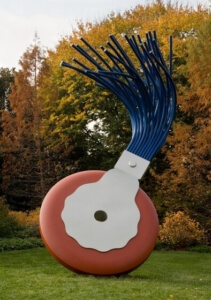
So, off I went again to the Mall, first stopping to sit on a bench, close my eyes, and breathe deeply for several minutes. (Step One in the Findlay method.) Next, I tried to let the art pick me (Step Two), rather than looking around for something “important,” or a piece by a well-known artist.

The giant red sculpture just ahead spoke to me—loudly. Step Three: DO NOT read the identifying plaque. You don’t need to know who made it. Let it speak to you on its own. Findlay suggests spending at least three minutes with a work to see what it might give us (Step Four). I checked my watch and started looking. The sculpture looked familiar and I was pretty sure I’d seen similar works crawling hugely over hill and dale at the outdoor Storm King Art Center in upstate New York, but I tried to put that out of my mind.

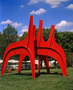
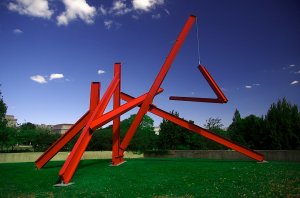
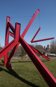
At first, I saw only the enormous red-orange I-beams arranged at various angles, with one V-shaped piece dangling by a cable. As I gazed, words began to float up in my mind: forthright, masculine, audacious, thrusting, grounded. But that V. That V was oddly touching, hanging out there at the mercy of the wind, moving and changing as it turned. I noticed several other Vs in the composition and, as the light changed, the sculpture began to look like an enormous drawing.

And then something happened. I felt a welling of emotion, of mysterious communion, of awe. The sensation was all the more delicious for being unexpected. In the end, I’d spent eight minutes with the piece and was reluctant to leave it. I suspect I’ll return again and again, seeking it out like an old friend.

Next, a bright and shiny object caught my eye: a life-sized stainless steel character out of a Hans Christian Anderson fairy tale – a peddler? I noticed all the stuff in his basket: a floppy rabbit, eggs, loaves of bread, cheeses, a ham. In the early days of Covid food shortages, this guy would have been a welcome sight. With his antique clothing – spats, clogs, a flowing smock, a jaunty cap, and that pipe – he was a kitschy voyager, back from “olden days.” Standing in front of the flying saucer Hirshhorn Museum, the effect was jarring.

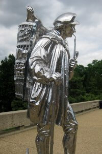
I circled the sculpture, all burnished and gleaming in the late-morning sun, I wasn’t sure how I felt about him. After about three minutes, a creepy sizzle from his eyes gave me the sense he was watching me. As I moved, his eyes followed. He seemed to say, with a leer, You have no idea who I am or where I came from, do you, honey? I shuddered. No epiphany with this guy, no communion, no awe.

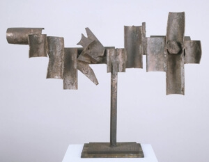
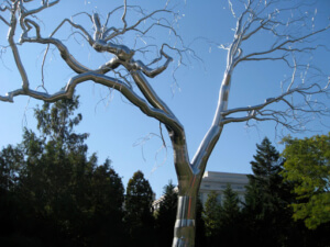
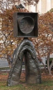
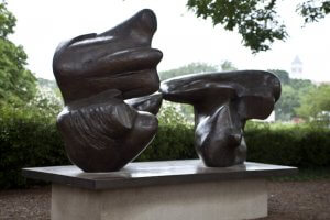
I was relieved to move on and soon came upon two large shapes on a pedestal. Dappled under trees, this piece of abstract art sits overlooking the brooding Rodins in the Hirshhorn’s sunken sculpture garden.

Now I was reminded of another Findlay dictum: to adopt an attitude, not only of seeing, but of watching a work of art. What does it do? Is it alive? As I walked around the sculpture, the bronze shapes did feel animated. I sensed how they yearned toward one another. With their bronze hide-like surface, they sported flippers, fins, arms, leg-like stumps. The shape on the right had the most inquisitive beak and the figure on the left reminded me of Martha Graham writhing in a tube-like sock, her arms protruding now and then to create an alien animal.

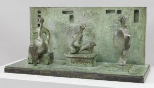
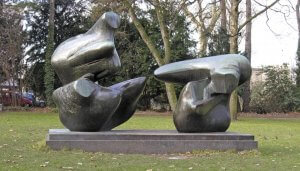
After three minutes of circling, I returned to the front of the sculpture. As I watched, the space between the figures began to vibrate and I swear I saw them move toward each other. The energy charge between the two creatures was electric. As I circled the sculpture again, it struck me that those shapes could never have taken any other shape that the ones they’d become. Broad and comforting, maybe male and female, maybe not, the pull they exerted on one another was palpable.

The six-minute experience with these two figures was entirely satisfying, but far quieter than my encounter with the big red sculpture, and far more pleasant than my encounter with Mr. Peddler.

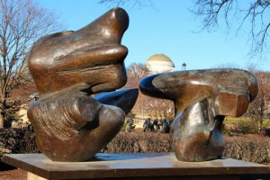
So there you have my experiment in seeing slowly. I highly recommend trying it with the public art where you live. Fortunately for me, Washington, DC is blessed with a large quantity of outdoor art, and as I get more and more hooked on sculpture, I’ll return to this space with more slow observations.

If you’re not in the least curious about who made these works, you can stop reading now.

But if you are, the ten-ton red sculpture, “Are Years What? (For Marianne Moore),” was created by Mark di Suvero in 1967. Moore’s poem, “What Are Years?” seems a remarkably apt one for our times. Click here to hear di Suvero reading it. https://www.youtube.com/watch?v=2l8TNZvLCPs

Or scroll down to the end of this post to read it yourself.

Marianne Moore

The stainless steel peddler, “Kiepenkerl,” was—yikes!—made by Jeff Koons in 1987. I hate Jeff Koons and his corny balloon dogs! But this work—a transitional one between his repurposed “readymades” (think latter-day Duchamp) and more original (if still outrageous) art. After listening to a Hirshhorn Museum curator’s talks on our man “Kiepenkerl,” I began to have some grudging respect for Koons. You can listen here: https://hirshhorn.si.edu/explore/fgt-kiepenkerl/

Finally, “Two-piece Reclining Figure, Points,” was created by Henry Moore in 1969-70 and cast in 1973. I love what he said about the two figures:

“The Two-Piece Reclining Figures must have been working around in the back of my mind for years, really. As long ago as 1934 I had done a number of smaller pieces composed of separate forms, two- and three-piece carvings in ironstone, ebony, alabaster and other materials. They were all more abstract than these. I don’t think it was a conscious or intentional thing for me to break up the figures in this way, but I suppose those earlier works from the thirties had something to do with it. . . . I did the first one in two pieces almost without intending to. But after I’d done it, then the second one became a conscious idea. I realised what an advantage a separated two-piece composition could have in relating figures to landscape. Knees and breasts are mountains. Once these two parts become separated you don’t expect it to be a naturalistic figure; therefore, you can justifiably make it like a landscape or a rock. If it is a single figure, you can guess what it’s going to be like. If it is in two pieces, there’s a bigger surprise, you have more unexpected views; therefore the special advantage over painting – of having the possibility of many different views – is more fully exploited.

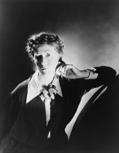
The front view doesn’t enable one to foresee the back view. As you move round it, the two parts overlap or they open up and there’s space between. Sculpture is like a journey. You have a different view as you return. The three-dimensional world is full of surprises in a way that a two-dimensional world could never be.”

[Henry Moore quoted in Carlton Lake, Henry Moore’s World, Atlantic Monthly, vol.209, no.1, January 1962, p.44]


What are Years, by Marianne Moore

What is our innocence,
what is our guilt? All are
naked, none is safe. And whence
is courage: the unanswered question,
the resolute doubt,—
dumbly calling, deafly listening—that
in misfortune, even death,
encourages others
and in its defeat, stirs

the soul to be strong? He
sees deep and is glad, who
accedes to mortality
and in his imprisonment rises
upon himself as
the sea in a chasm, struggling to be
free and unable to be,
in its surrendering
finds its continuing.

So he who strongly feels,
behaves. The very bird,
grown taller as he sings, steels
his form straight up. Though he is captive,
his mighty singing
says, satisfaction is a lowly
thing, how pure a thing is joy.
This is mortality,
this is eternity.


Every time I see the Dana Tai Soon Burgess Dance Company perform, I wish I could watch each dance over and over again.

The Company Rehearsing

On Saturday, my wish came true.

My friend Jeanne and I were privileged to observe a rehearsal for the up-coming DTSBDC show, “Portraits.” This June 15th and 16th performance at the Kennedy Center’s Terrace Theater will celebrate the company’s 25th year of delighting audiences as Washington, DC’s preeminent dance company.

The first dance rehearsed was “Confluence,” reviewed in this space on April 19, 2014 when it premiered in the magnificent Kogod Courtyard at the National Portrait Gallery. http://ellenkwatnoski.com/premier-confluence-dana-tae-soon-burgess-at-the-national-portrait-gallery-april-19-2014/

Even though this was a rehearsal, with stops and breaks for Burgess’s and Katia Chupashko Norri’s (associate rehearsal director), inventive notes to the dancers, this piece still took our breath away. Choreographer Burgess was inspired by the moody 1938 portrait of modern dance pioneer Doris Humphrey by Barbara Morgan. The portrait was part of the Smithsonian Portrait Gallery’s show, “Dance the Dream,” which featured portraits of legendary dancers, Burgess himself among them.

Doris Humphrey, by Barbara Morgan, 1938

Fraught with psychological overtones, this dance expresses “an emotional terrain of the mind”—in Burgess’s words—the uncomfortable state brought about by short meetings—trysts—in which unresolved feelings abound.

The dancers became lit from within as they got into character—even though still working out spacing, timing, and minute changes in hand gestures, arm shapes, and where the dancer’s eyes should be focused. These and many other adjustments will ultimately combine to form the intention, emotional content, and musicality of the final performance. We were struck by Burgess’s and Norri’s precise and sometimes amusing notes to the dancers: “After the contact lens moment,” (a dancer plucks something invisible from the floor), “The music is pulling you in,” “Picture lasers in your arms carving the space into a figure eight.”

From the 2014 National Portrait Gallery Premier

The music for this piece is haunting. Ernest Bloch’s “Hebraic Suite” pumps up the emotional content, building tension as the dancers lift each other, fleetingly touch, curl to the ground, and pepper their lyrical movements with highly original hand gestures: pecking, stabbing, caressing, striking, and swooping in crane-like arches.

From the Premier

Next, the company worked on “I Am Vertical,” a dance inspired by Sylvia Plath’s poem of the same name. Again, as the first-ever resident choreographer at the National Portrait Gallery, Burgess took his inspiration from a small but devastating NPG show of Plath’s art and writing. The dance opens with several couples dancing a spirited lindy hop to “Take the A Train.” When the music morphs into a surreal warp, a disembodied voice begins to read Plath’s poem: “I am Vertical…But I would rather be horizontal.” The dance plays with planes – upright and utterly still lying down. Following the poem’s haunting ending, “I shall be useful when I lie down finally,” we hear Plath interviewed about her fateful meeting with fellow poet and husband-to-be Ted Hughes. The role of Plath is danced by Sarah Halzack, with three other women dancers appearing as muses or influences on the poet; they change roles now and then, with each seated, miming typing on an invisible typewriter.

Sylvia Plath 1932 – 1963

Again, the dancing is sublime, the choreography original, and the emotional content utterly riveting.

After the rehearsal when the associate artistic director Kelly Moss Southall began literally to roll up the floor, we chatted briefly with Dana regarding the Plath piece. Jeanne, my friend, is a dance lover and a poet herself. Dana told us a bit about his process in creating a dance, how each dancer has her or his own motivations, inner desires, and character arc, and that each section of the dance corresponds to a chapter in a book, or an act in a play.

Once again, we could have watched for hours – and luckily, we will all get the chance to see these gem-like pieces—among others—performed at the Kennedy Center on Friday, June 15th and Saturday, June 16th at the Kennedy Center’s Terrace Theater, 7:30PM. Tickets are on sale now!

http://www.kennedy-center.org/calendar/event/RSXAL

I hope to see you at this much-anticipated event in celebration of the Dana Tai Soon Burgess Dance Company’s 25th year. We are fortunate indeed to have this stellar dance company performing in Washington, DC, but, in the words of the Washington Post’s dance critic, Sara Kaufman, “This artist is not only a Washington prize, but a national dance treasure.”

I am Vertical
by Sylvia Plath

But I would rather be horizontal.
I am not a tree with my root in the soil
Sucking up minerals and motherly love
So that each March I may gleam into leaf,
Nor am I the beauty of a garden bed
Attracting my share of Ahs and spectacularly painted,
Unknowing I must soon unpetal.
Compared with me, a tree is immortal
And a flower-head not tall, but more startling,
And I want the one’s longevity and the other’s daring.

Tonight, in the infinitesimal light of the stars,
The trees and the flowers have been strewing their cool odors.
I walk among them, but none of them are noticing.
Sometimes I think that when I am sleeping
I must most perfectly resemble them —
Thoughts gone dim.
It is more natural to me, lying down.
Then the sky and I are in open conversation,
And I shall be useful when I lie down finally:
Then the trees may touch me for once, and the flowers have time for me.


Infinity Mirror Room

After what seems a long hiatus away from this space, your intrepid art blogger is back, excited to tell you about “Yayoi Kusama: Infinity Mirrors,” now on view at the Hirshhorn Museum and Sculpture Garden in Washington, D.C. This popular show has been mobbed with fans during its entire run. More often than not, timed passes on offer at the museum’s website are gobbled up at precisely noon each Monday. My dear friend Jeanne somehow managed to score two passes.

Despite the hassle of getting to see the show, it’s gratifying the excitement this 87-year-old artist has kicked up, especially among young people. Jeanne and I were among only a handful of older people at the museum last Thursday afternoon.

“Violet Obsession,” 1994

This exuberant show is vast — more than 60 paintings, works on paper, sculptures, and installations, including six “infinity mirror rooms” in which banks of LED lights, balloons, and the viewer him or herself repeats endlessly in the mirrored walls.

The show opens with a series of striking works on paper, particularly “Pacific Ocean,” 1959, watercolor and ink. This image, inspired by sun on water as seen from a plane, sparked Kusama’s later “infinity net” paintings.

Next, we came to another seminal work of 1994, a phallus-bedecked rowboat in a room covered in black wallpaper dotted with repeating photographic images of “Violet Obsession,” also the name of a small volume of poetry by the artist.

Gallery of “Accumulations”

Much of this prolific artist’s work has been shaped by her life-long experiences with anxiety and other emotional disorders that have at times erupted into full-blown psychosis. So fragile is her mental state that she voluntarily lives in a psychiatric hospital not far from her studio in Tokyo. Such challenges could well have derailed her creative career. Instead, the soothing aspect of the repetition and duplication of images formed the basis of her work, spurring her on to greater and greater achievement. And she’s not done yet. She still paints daily, from her wheelchair, with canvasses resting on the floor or tables in her studio.

In an effort to rid herself of her fear of sex, Kusama create whimsical “accumulations” of hand-made stuffed tubers affixed to objects and surfaces. Who’s to say if they helped the artist with her fears? All we can do is enjoy them.

“No. Green No. 1,” 1961

Several large mesmerizing “infinity net” paintings are hung together in the same gallery as the accumulations. Beginning at the age of ten, Kusama began painting repetitive polka dots and nets to calm her agitation due to a turbulent family life. Formed of countless loops, with some paint texture visible and bathed in luminous color, these works are utterly absorbing. Hauntingly ethereal, they form a fascinating counterpoint to the stuffed protuberances across the room. The wall text observes that Kusama’s infinity nets happened to jibe with the “painterly qualities of abstract expressionism and the restraint and monochrome [palate] of minimalism,” both on display in “No. Green No. 1,” 1961.

Waiting line for the first of the “infinity mirror rooms,” (using mirrors was Kusama’s way of continuing her theme of repetition without destroying her fingers and hands sewing and stuffing fabric tubes with kapok), we took in a slide show of the artist’s 1966 14th Street “Happening” in which she appears to pop in and out of a phallus be-decked box.

“14th Street Happening,” 1966

The six infinity mirror rooms on display here create a dazzle of reflections of themselves and the viewer. “All the Eternal Love I Have for the Pumpkins,” 1966, was our favorite. Kusama’s family was in the plant seed business and she remembers being charmed by the dumpling-shaped gourds as a child. The acrylic pumpkins are indeed charming; begging to be touched. We resisted, but evidently one of the pumpkins was damaged by a viewer, causing the show to be briefly closed while curators rearranged the pumpkin field.

Once inside each of the mirrored rooms, our images, along with a seemingly infinite number of pumpkins, phalli, balloons, polka dots and pin-point lights were multiplied to the vanishing point. Viewers are allowed exactly 30 seconds before the next pair of attendees is let in. These structures are fun, make no mistake, but for me, at least, they caused nothing like the enveloping merge-with-the cosmos sensation we were led to expect. Instead, they come off as a side-show/fun house sort of gimmick. And the waits are LONG, my friends. After three mirrored infinity room, one feels like it’s taken at least a millennium to get to the next one.

“All the Eternal Love I have for the Pumpkins,” 2016

On the other hand, a series of collages are unexpectedly subtle, moving, and mysterious. Look for “Soul Going Back to its Home,” 1975, a touching homage made for Kusama’s friend the surrealist artist Joseph Cornell who had recently died.

The exhibit closes with the made-for-the Hirshhorn “Obliteration Room.” Each museum goer, or pair of them, is given specially made stickers to apply to the all-white room. Furnished with donated Ikea furniture, books, lamps, and other household objects furnished by museum staff, the room’s surfaces are slowly being obliterated by colorful dots.

If you choose to make the trek, and if the gods of the Hirshhorn’s balky website are with you, bring water and wear comfy shoes, and, of course, bring your phone or a camera. You won’t be able to resist at least one selfie.

“Obliteration Room”

Once the Hirshhorn show closes on May 14, good news: it will move on to the Seattle Museum of Art, June 30-September 10; the Broad, Los Angeles, October 21- January 10, 2018; the Art Gallery of Ontario, Toronto, March 3-May 27, 2018; the Cleveland Museum of Art, July 9-September 30, 2018; and the High Museum of Art in Atlanta, November 18-February 17, 2019.

http://hirshhorn.si.edu/kusama/infinity-rooms/


Aerial view of the NGA roof terrace

Aerial view of the NGA roof terrace

Well worth the three-year wait, the newly redesigned and refurbished East Building of the National Gallery of Art has reopened. Perry Chin, a colleague of I.M. Pei, architect of the original, undertook the extensive, if subtle reworking. First opened in 1978 to house modern and contemporary art, the building is comprised of interlocking triangles reflecting the shape of the original parcel of land.

The works now on view incorporate more than 200 of the NGA’s plunder of the now defunct Corcoran Gallery’s collection (an astonishing 8,766 works). As reported recently in the Wall Street Journal, the NGA got to choose whatever it wanted from the Corcoran’s collection (dream job, or what?) after the dear old gallery’s financial demise. Now many choice pieces benefit—as do we—from the smart reworking of gallery space.

"Hahn/Coick," 2013, by Katharina Fritsch

“Hahn/Coick,” 2013, by Katharina Fritsch

For my first visit, I decided to start at the top—the new outdoor roof terrace—and work my way down. Never made it to the bottom. Another day, another blog!

With a sweeping view of Pennsylvania Avenue, the terrace houses modern sculpture, including George Rickey’s mesmerizing “Divided Square Oblique,” 1981. I sat on a bench and watched those stainless steel wand swing and dip to form seemingly endless combinations. Soon a museum employee scuttled around to polish the “Do Not Touch” signs embedded in the floor near each sculpture. A good thing, too, as Katharina Fritsch’s “Hahn/Cock,” 2013, polyester resin, begged to be touched. Seen here through the stainless pipes of Kenneth Snelson’s “V-X,” 1968, the monumental rooster is sure to become a favorite selfie spot.

"Three Motives Against a Wall No.1" 1958, by Henry Moore

“Three Motives Against a Wall No.1” 1958, by Henry Moore

Just inside the door leading from the sculpture terrace to Tower One, I was captivated by the amusingly named “Three Motives against a Wall, Number One,” 1958, a small Henry Moore bronze. This mix of small delights and monumental construction is one of the charms of the East Building. Unlike, for example, the Museum of Modern Art in New York, whose vast entry/atrium seems to exist more to elevate the architect than to house art. I could go on—think “starchictects” we know and don’t love—but why, when there’s so much to love here?

"Stations of the Cross," 1966, by Barnett Newman and Mark Rothko, Classic Paintings

“Stations of the Cross,” 1966, by Barnett Newman and Mark Rothko, Classic Paintings

Namely, the spare “Stations of the Cross,” 1966, in the new tower gallery. Comprised of fourteen paintings by Barnett Newman, this work was first exhibited at the Guggenheim in 1966. Since then, these paintings have received lots of critical acclaim and a good bit of distain as well. Newman has said that the line in his paintings—he called them “zips”—symbolized an individual man or woman, reduced to his or her most essential representation. Raised Jewish in New York City, are we to think from the title that Newman converted to Catholicism?  No, as the wall text explains. These works, meant to be seen sequentially, explore a single theme. Jesus’s cry on the cross—“Why have you forsaken me?”—is also our existential question as humans. What are we doing here and what comes next?

"Shell No. 1," 1928, by Georgia O'Keeffe

“Shell No. 1,” 1928, by Georgia O’Keeffe

The adjacent gallery, also lit by filtered tower light, gives us “Mark Rothko: The Classic Paintings.” Here in early works, the artist explores basic human emotions of “…tragedy, ecstasy, doom.” Stepping into this gallery, we Washingtonians think immediately of the Rothko room at the Phillips Collection. The comparison works in favor of both institutions. The small room at the Phillips allows viewers to be immersed in the pulsing color of the paintings, up close and personal. And although the tower room is considerably larger, the same reverential feeling abides. Taken as a whole, the Newman and Rothko tower galleries feel like a sacred space.

Walking down the staircase leading from Tower One to the Upper Level (Modern Art from the Collection), it seemed as if every inch had been buffed and polished. Or maybe the staircase is one of the new ones. I’m hoping to take a tour that will make clear how the building was renovated. As it stands, it all feels so fresh and new that it’s hard to recall how the original spaces were configured.

"Germinal," 1967, by Louise Bourgeois

“Germinal,” 1967, by Louise Bourgeois

In the “Dada and Beyond” gallery, the curators have filled a case of small oddities that coexist so beautifully it’s as if they were made to be together. Georgia O’Keeffe’s beguiling “Shell No. 1,” painted in 1928, hangs with several Joseph Cornell boxes. These are kindred spirits of Betye Saar’s “Twilight Awakening,” made fifty years after O’Keeffe’s luminous shell. “Germinal,” a 1967 marble sculpture by Louise Bourgeois possesses the sly humor of its casemates. Notions of theft flit through the mind. They’re all small enough to fit in…oh, never mind.

Walking through the gallery entitled “Birth of Abstraction,” I passed a flock of Brancusi sculptures, each mounted on gorgeous wooden bases, to find Wassily Kandinsky’s “Improvisation 31 (Sea Battle),” 1913. The piece does roil and splash, colors hitting colors with exuberance, but not quite the violence suggested by the title. How fresh and modern this picture feels103 years later.

"Improvisation 31 (Sea Battle)", 1913, by Wassily Kandinsky

“Improvisation 31 (Sea Battle)”, 1913, by Wassily Kandinsky

Color also rules in Hans Hofmann’s “Autumn Gold,” 1957. I can get lost in this composition, enjoying the tactile application of paint, how colors slap up against other colors. Clearly the artist loved paint for paint’s sake.

Much more controlled is Gene Davis’s “Black Popcorn,” 1965. Hung in the space entitled, “Color Field and Edge,” it’s an old friend from the Corcoran collection. Here the color is sparked by black stripes. The so-called “Washington Color School” gets ample billing here, thanks to the NGA’s Corcoran windfall.

autumn-gold

“Autumn Gold,” 1957, by Hans Hofmann

Nearby hangs Sam Gilliam’s “Relative,” 1969. Gilliam, now 82, is breaking new ground with a monumental piece commissioned by the Museum of African American History and Culture. Can’t wait to see it. Gilliam’s work, always hard to categorize, evolved from figurative work to the breakthrough in which he abandoned the frame entirely. In the “draped” paintings, the canvas is painted with abstract images and then hung—from walls, ceilings, even the front of a building in Philadelphia. Rather than hanging limp or inert, “Relative” seems to march across the wall with great energy.

"Black Popcorn," 1965, by Gene Davis

“Black Popcorn,” 1965, by Gene Davis

After an hour and a half, I’d savored the art (oh, those shimmering Morandi still lifes!), and also reveled in the building itself, gleaming and full to bursting, topped off by that friendly alien, the Alexander Calder mobile. Later, I was stunned to learn that it was the final monumental piece commissioned from Calder, and that he died shortly after the untitled mobile was installed in the East Building. Knowing that, I’ll see it just a bit differently, but always with awe and affection.

"Relative," 1969, by Sam Gilliam

“Relative,” 1969, by Sam Gilliam

Good news: the terrace café has reopened, albeit offering packaged food and get-it-yourself coffee, sadly, but still…you can sip your coffee and nibble on your scone and watch the Calder mobile languidly traverse that extraordinary space.

"Untitled," 1978 by Alexander Calder

“Untitled,” 1978 by Alexander Calder

For a glimpse of how the precision work was done to create the building in the 1970s, click the link below and view a twelve-minute documentary which also shows Calder, Robert Motherwell, and Henry Moore in collaboration with architect I.M. Pei and then-museum director, the stylish impresario,  J. Carter Brown.

https://www.youtube.com/watch?v=PeXiV3L-f3E

"Hide and Seek," 1888

“Hide and Seek,” 1888

For years I’ve loved a painting in the permanent collection of the Phillips Collection in Washington, DC. “Hide and Seek,” 1888, by William Merritt Chase, never fails to bewitch me: the play of dark and light, the sense of a photo having been snapped in mid-action, the feeling that you’ve entered a world that propels you back to your own childhood. You feel the excitement of the game; hear the tapping of feet on that gleaming floor. Yet the picture has a mysterious element, one that hints at thresholds, leaving childhood behind, even going through a final door into blinding light: is it harsh or benevolent?


"Portrait of Dora Wheeler," 1883

“Portrait of Dora Wheeler,” 1883

Enough of that blather. You get the idea. But while the picture knocks me out, I knew next to nothing about the artist. A recent Phillips Collection retrospective of this influential artist’s career—spanning the late 1800s and early 20th century—was a revelation. Chase, an American who trained abroad as a young man, cut a dashing figure in his ornate 10th Street studio in New York City. Despite his eccentricity and reputation as a bon vivant, he was a devoted family man and a respected teacher whose Chase School became the Parsons School of Design.


The show—some 70 works drawn from museums and private collections all over the country— was organized chronologically and by subject: historical genre paintings, landscapes, the seaside, domestic interiors, public parks. All were delightful. But on my second visit, I found myself most drawn to Chase’s portraits.


"James Abbott McNeil Whistler," 1885

“James Abbott McNeil Whistler,” 1885

“Portrait of Dora Wheeler,” painted in 1883, was intended as an exhibition piece, showing off Chase’s formidable skills. Dora Wheeler, a former student, was a textile designer in the same 10th Street building as Chase’s studio. This large oil painting, with its thoughtful sitter and brilliant yellow background, won an honorable mention at the Paris Salon, but was generally panned by New York critics, as far too “radical a departure from convention.” The image of Wheeler was thought to be “lost” in the sea of textured brocade.


"The Young Orphan (At Her Ease)," 1884

“The Young Orphan (At Her Ease),” 1884

Surprise! I did know another of Chase’s paintings. Coming upon his portrait of James McNeil Whistler was like running into an old friend. Bequeathed to the Metropolitan Museum of Art in New York in 1918, I’d seen it many times. In 1885, Chase, long an admirer of Whistler, paid him a visit in London on his way to Madrid. The older artist suggested the young Chase stay and allow time for each of them to paint the other’s portrait. Chase’s portrait was intended as an homage, using many of Whistler’s own techniques and conventions: free brushwork, a somber palette, the figure floating in space. Whistler, though, thought it an unflattering “abomination,” and may well have destroyed his own portrait of Chase in a fit of pique.


"Meditation," 1886

“Meditation,” 1886

“The Young Orphan,” painted the year before, is arresting. It’s only paint on canvas, we know that, but we also feel that we are looking at a real person who once lived and is still alive somehow. The model likely came from the quaintly named Protestant Half Orphan Asylum next door to the 10th Street studio. The exquisitely detailed hair, and lush rendering of the chair is tour de force painting. The picture evokes the influence of Whistler and John Singer Sargent, as the girl floats in a sea of crimson, her black dress an almost abstract shape.


"Lydia Field Emmet," 1892

“Lydia Field Emmet,” 1892

Chase also shows off his ability to render texture in “Meditation,” 1886. The drapery in the background looks like watered silk, or imitates brushstrokes. This intriguing portrait (presumably of his wife to be, Alice Gerson, whom he married the following year) is done in pastel, not oil. Hard to believe. Anyone who’s worked in the medium knows how hard it is to control, and how ambitious it would be to take on such a large, complex composition. I love the sitter’s direct, yet somehow veiled gaze. She’s likely thinking interesting thoughts about the painter.


Another student of Chase’s, Lydia Field Emmet, became a noted society painter and designer of Tiffany glass. In this 1892 portrait Chase again defies convention by posing her much as a noble gentleman would be seen in a classic Rembrandt or Frans Hals, painters Chase adored while studying in Europe. In researching Emmet, I learned, as I has suspected, she was related to dear friends of the same name, descendants of the Irish poet and rebel patriot, Robert Emmet. I again experienced that sizzle of connection: yes, she’s long dead and gone, but something in her gaze spoke to me. And I spoke back, telling her (in my head, of course) about the new additions to her long lineage who lived,  until recently, not far from where her image now hangs in the Brooklyn Museum.


"Mother and Child (The First Portrait)," 1888

“Mother and Child (The First Portrait),” 1888

“Mother and Child (The First Portrait),” ca. 1888, is a dramatic full-length oil painting of Alice Chase and her first baby. The child appears about to wiggle out of its mother’s arms, while Alice herself is a static, monumental figure in her figured black robe. She seems about to turn toward the viewer, and although viewed in profile, has none of the hauteur of Lydia Field Emmet, as appropriate for the subject. Despite its intimate, domestic nature, Chase imbues the image with a grandeur and solemnity which surprised me. In a good way.


Art historians may debate whether William Merritt Chase was an American Impressionist, or a realist, but it seems to me he was both, able to capture light and skew his compositions in interesting and modern ways while communicating a very real sense of time and place. If you missed the show, take a look at this video: http://www.phillipscollection.org/exhibitions


A very fine exhibition catalogue is also available through the Phillips Collection store and at Amazon.com.


Enjoy!


"Lucky U," 1960

“Lucky U,” 1960

The title of this show is taken from Robert Irwin’s words about his intention to move from traditional art—paint on canvas—to more “conditional” works that deal with light and space directly. At the Hirschhorn Museum in DC, this is the first historical survey of the California artist’s work from the late 1950s through today. Up until September 5, 2016—the Hirshhorn is the only venue—it’s a rare treat.

"Ocean Park," 1960-61

“Ocean Park,” 1960-61

Of the show, its curator, Evelyn Hankins said, “The historical portion of the exhibition includes many rarely seen works that, because of their extremely subtle nature, demand in-person viewing. And as both these objects and the new installation demonstrate, Irwin’s art becomes fully present only when you are standing in the physical space, experiencing it over an extended period of time.” Italics mine.

In the late 1950s Irwin created small works meant to be held by the viewer. Beautifully framed in wood, these small paintings hang on two walls and lie flat in a case in the middle of the gallery. They possess a tactile, restless energy that does invite touch. “Lucky U,” a little charmer made in 1960, was loaned from the collection of the artist, now 87.

crazy ottoA larger painting, “Ocean Park,” 1960-61, evokes the series of the same name made by Richard Diebenkorn. Irwin’s vision of the California community where both artists drew inspiration is more kinetic that Diebenkorn’s calmer vision. Lines fly as if hurled by some paint-wielding Thor. Is that a jet plane about to land? Cars streaming by? Tides surging, lawn chairs in a jumble? Loved it. Then I read that this was one of the “pick-up sticks” paintings in which Irwin wanted to expel any visual associations with the real world. Oops.

From 1961 to 1964, Irwin made a series of “line” paintings in his desire to obliterate the “Rorschach effect” in which the eye makes associations with elements of nature or human figures. Or lawn chairs. In “Crazy Otto,” 1962, four heliotrope lines vibrate against a vivid background. One thinks first of Otto. Who was he? In what way was he crazy? And then, inevitably, of Rothko.

"Untitled," 1963-65

“Untitled,” 1963-65

The artist further challenged himself to make a painting without making a visible mark. This, our curator Hankins tells us, is the flex point in Irwin’s career. In the “dot paintings” he has made works that require an “active, persevering viewer.” True. It’s impossible to see these works in reproduction, or even standing back from them by the usual three or four feet. In “Untitled,” 1963-65, what looks like a uniform white ground is revealed to be gazillions of tiny dots in complementary colors that effectively cancel each other out.

In 1966 Irwin abandoned painting on canvas altogether and began working with auto body shops and industrial fabricators to create objects that test the “experiential and material limits of art.”

Acrylic Column, 1969 - 2011

Acrylic Column, 1969 – 2011

Floor-to-ceiling acrylic columns, triangular in shape, and highly polished, refract light while doing very interesting things to the people who walk by them. Something about the simplicity of conception and the quality of execution of these columns made me think of Donald Judd’s work in mill aluminum. Just as I wondered if the artists knew one another, two photographers began to set up, each wearing T-shirts that read, “Robert Irwin Opening: Dawn to Dusk, 23 July, 2016, Marfa Texas.” They were absorbed in their work, and didn’t seem approachable, but a young woman who appeared to be with them said they were working on a documentary.

"Dawn to Dusk," 2016, at the Chinati Foundation in Marfa, Texas

“Dawn to Dusk,” 2016, at the Chinati Foundation in Marfa, Texas

Later, Google filled me in. Yes, Judd and Irwin knew each other and Judd admired and collected Irwin’s work. Sixteen years in the planning, a new large-scale Irwin piece was installed this month in an old Army hospital at Judd’s Chinati Foundation in Marfa. For more on Donald Judd and Chinati, see my October, 2013 blog post.

http://ellenkwatnoski.com/road-trip-minimalism-to-the-max-in-marfa-tx/

Made in 1969, the “Untitled” disc had me and a group of young art campers enthralled. The painted aluminum disc gives off a pale yellow radiance that blushes at the edges. Again, the artist is playing with our perception of “art.” Shadow and light are as important to this ethereal piece as paint on aluminum.

Untitled Disc, 1966-67

Untitled Disc, 1966-67

Even more spell-binding is another of the untitled disc series, also made in 1969. Lit from above, the work is positively otherworldly. I expected it to speak, utter oracular wisdom, or some Hal-like pronouncement.

The Hirshhorn is a giant doughnut of a building, with the galleries along the outer rim and a ring of glass overlooking a fountain in the interior hole of the doughnut. When you walk from gallery to gallery, you’re aware of the circle you’re tracing, but at the same time, not.

Untitled Disc, 1969

Untitled Disc, 1969

Entering “Squaring the Circle,” 2016, Irwin’s site-specific piece, you’re warned that your “perceptions will be challenged.” In the center of a wall is a doorway within a glowing white space. You feel pulled toward the door. Is it real? Can you walk through it without, like Alice, being plunged into some new reality? After a bit of exploration, you realize the curve of the gallery wall has flattened. In fact, the “wall” is a white gauze scrim stretched across the vast space so that it appears solid and the door appears to float inside the actual door to the outer rim of the doughnut.

"Squaring the Circle," 2016

“Squaring the Circle,” 2016

The show closes with a 1973 video of Irwin speaking about his art. I wasn’t able to find it on YouTube, but here’s a link to his fascinating talk at Stanford University in which both the Hirshhorn and Marfa installations are discussed.

You have to put up with a gassy introduction, but it’s worth it. https://www.youtube.com/watch?v=5Ac-m3W9fGY


Said Hirshhorn Curator Evelyn Hankins, who organized the exhibition. “The historical portion of the exhibition includes many rarely seen works that, because of their extremely subtle nature, demand in-person viewing. And as both these objects and the new installation demonstrate, Irwin’s art becomes fully present only when you are standing in the physical space, experiencing it over an extended period of time.”


.