
Ceiling, Kogod Courtyard, National Portrait Gallery
We gathered under the floating glass and steel roof of the Kogod Courtyard. Encircled by the Portrait Gallery and the American Art Museum in Washington, DC, the courtyard, with its filtered light and lacey trees, is always magical. But on Saturday, November 16, it bloomed in a new way when the Dana Tai Soon Burgess Dance Company took to the floor to perform a new site-specific work, “Homage.”
Inspired by the show now on display, “Dancing the Dream,” the piece drew from the work of the greats of American dance: Katherine Dunham, Martha Graham, Alvin Ailey, and Bill T. Jones, to name just a few. The accompanying music drew from the show as well, and flowed into spoken commentary by dance sages: Merce and Martha, Bob Fosse, and others’ voices I didn’t recognize. No matter—the combination of music and spoken word blended well and reminded the audience that dancers are smart, and that dance is about ideas, emotion, and idiosyncratic expression as much as it is about supple, rigorously trained bodies.

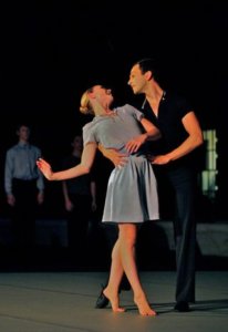
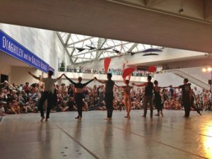
Rehearsal, “Homage,” at National Portrait Gallery, Dana Tai Soon Burgess Company
But oh, those bodies! Burgess’s dancers are highly skilled performers of his fluid, organic, choreography. Theirs is a quiet strength, never flashy, but delivering the emotional depth and joy this piece demanded.
Opening with a bang and declaring right off the bat that the piece was to celebrate and explore the heart of what makes American dance American—a “regular guy” burst onto the stage in a blue shirt and bow tie. Dancing along to an exuberant “Yankee Doodle Dandy,” he was joined by eight dancers who performed duets, solos, and ensemble dances. Accompanied by classical music, blues, rock, Elvis, and possibly Shirley McLaine, the choreography suggested rather than mimicked the greats of Broadway, ballet, and modern dance. Love duets were particularly fresh and charming. The dancers moved in perfect unison even when dancing to the spoken word. They were counting in their heads, you knew that, but their rapt faces never betrayed anything other than the spontaneous joy of the dance.

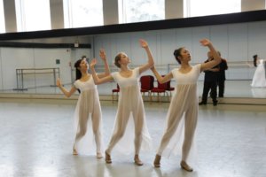
“Homage”
Judy Hansen’s costumes were perfect. In a range of blues and blacks, they included a swingy ingénue dress, simple work-out clothes, and a jaunty Busby Berkeley-like culottes dress with a pale blue collar.
After the performance, “Dancing the Dream” beckoned from inside the Portrait Gallery. The show “tells the story of performers, choreographers, and impresarios who harnessed America’s diversity and dynamism into dance styles that defined the American experience,” through “experiment and lack of truck with the past.” Organized by rooms devoted to Pop, Ballet, Broadway, Hollywood, and Choreography, all painted in vivid colors–Chinese red, lime green, peacock blue, fuchsia, and a deep marigold–the show presents portraits of dance greats in all media: film, photography, drawings, paintings, posters, and video clips.
The photographs drew me most powerfully.

Suzanne Farrell and Peter Martins (from “Chaconne”), by Max Waldman, 1976
Here are the sweetly paired Peter Martins and Balanchine muse Suzanne Farrell, by Max Waldman, 1976, accompanied by this quote from Martins: “. . . We were literally dancing the music. I felt like a violin.”
Michio Ito, pictured in an image by Nickolas Murray, 1921, has a fascinating story. He visited Paris in 1911 where he saw Isadora Duncan and the Diaghilev Company perform. Profoundly affected by this experience, he formed his own troupe and went to Hollywood in 1929. After Pearl Harbor he was interned, nay imprisoned, at a relocation camp in New Mexico until 1943 when he was repatriated to Japan in a prisoner of war exchange. After the war, he choreographed revues for the soldiers of the American occupation in Tokyo.
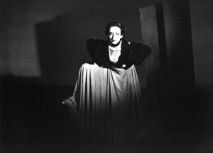
Doris Humphrey, by Barbara Morgan, 1938
After studying at the pioneering Denishawn School, Doris Humphrey developed her own technique that emphasized breath, balance, “fall and recovery,” using weight and spatial orientation in new ways. She left the dance world her invention– “labanotation”–a system for recording dance which allows choreography to be passed along to future performers. Here she is, as photographed by Barbara Morgan in 1938.
Judith Jamison, upon taking over as head of the Alvin Ailey Company, said, “I don’t feel I’m standing in anyone’s shoes. I’m standing on Alvin’s shoulders.” This gorgeous image taken by Max Waldman in 1976, shows her own formidable shoulders and strong presence.
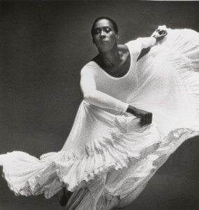
Judith Jamison, by Max Waldman, 1976
Gregory Hines, who raised tap dancing to a high art and believed it to be the true American dance form, started off performing as a child with his brother and father in “Hines, Hines and Dad.” I love this barefoot image by Robert Mapplethorpe taken in 1985.
Finally, the incomparable Bill T. Jones, as captured by Robert Mapplethorpe, again in 1985. Founder of a highly experimental dance company with Arne Zane in the 1970s, Jones used improvisation and an individual style to shape his works, among them Tony award winning “Fela!”

Gregory HInes, by Robert Mapplethorpe, 1985
While I was delighted to see a portrait of our own Dana Tai Soon Burgess (Mary Noble Ours, 1978) I could have done without Beyonce’s video of “Single Ladies (Put a Ring on It)” and sorely missed seeing an image of one of the most important modern dance pioneers, Erick Hawkins, my great teacher in New York.
Still, there is much to love here: the mind-blowing Nicholas Brothers leaping down stairs and landing in the splits, a campy Busby Berkeley water ballet, the irrepressible Josephine Baker in her banana skirt, John Travolta’s oddly robotic “Saturday Night Fever” disco performance, and much more. The footage from “Soul Train” juxtaposed against that from “Dance Party” speaks volumes.

Bill T. Jones, by Robert Mapplethorpe, 1985
On view until July 13, 2014, this show is not to be missed if you’re a dance lover, or simply an appreciator of this wildly diverse and creative country we live in.
Click here for more information:
http://www.npg.si.edu/exhibit/exhdance.html
To learn more about the Dana Tai Soon Burgess Company, please click here:


 During the interval between performances, Fredmann talked about Natalia Gonchorova’s complete redesign of the Firebird set (see my earlier blog post
  If you come to the August 11, 2013 performance by Dana Tae Soon Burgess you’ll see original choreography premiered in a suite of dances “inspired by the spirit of the Ballets Russes.” Come early! There will be two performances at 1:30 and 3:30, best seen from the front rows or standing in the back of the performance space. The riser is low enough to provide a limited line of sight much further back than the third or fourth row.